
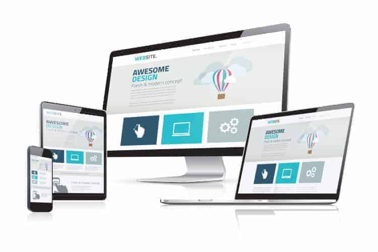
How does your current website look when you view it on your smartphone? If it’s not already set up for viewing on mobile devices, chances are it’s too small or scrolls sideways off the screen. Either way, it’s difficult for potential clients to read and navigate. Responsive Web Design (RWD) makes your website easy to use and attractive to your visitors on any device.
Interesting statistics
According to study conducted by comScore in late 2014, mobile internet usage accounts for 60% of time spent online. Furthermore, statistics show that 61% of users that find your site from a mobile device will actually call or visit your business in person. It’s also been shown that 50% of users that access your site from a mobile device will actually purchase your services, so you can see just how important mobile-friendly websites have become.
Google Mobilegeddon
You may have already heard about the Google Mobile-Friendly update, more commonly referred to as “Google Mobilegeddon”. It refers to an update to Google’s search algorithm on April 21, 2015, which causes responsive websites to be preferred in search results. What this means, in a nutshell, is that those not using RWD have lost their ranking in search results, in most cases.
How has RWD changed things?
It used to be that a website’s main focus was on the larger formats, like traditional computers and laptops. If a mobile version of the site was desired, special software would be installed that automatically detected what kind of device the user was visiting with. Since different devices identified themselves to the software in various ways, it was (and still is) difficult to detect every possible type of device. Additionally, this software requires it’s own templates to operate properly, which means there are two versions of your website to design and maintain. This type of software is still very common because it does still have its place in the market, but for specific applications.
Additional benefits
One of the best features of having a responsive website is the inclusion of special links into the site for devices that are most likely to be a mobile phone. For example, your phone number could be made “tappable” by mobile phones — when someone taps on your phone number, it automatically opens the phone’s dialer and populates the number field with your phone number. How convenient! A similar solution can be used for a location map on your website where a user taps the map and the phone’s mapping application (such as Google Maps) opens automatically. Your location is presented to the user right on their mobile device, making it easy for them to find directions and/or navigate to your location using GPS.
How we can help you
At Harness Media, we can provide a mobile format for your website using either method. We do usually recommend the responsive route because of it’s many advantages. We specialize in responsive websites so let us help you get your website into the modern era. In fact, we use a responsive design for our own website! Feel free to browse it on your phone, tablet, laptop or other device.
If you would like more information or have any questions, please feel free to contact us.